A very simple WPF mistake that can creep up on you
Failing to understand or simply neglecting the relevance of Panels in WPF can very easily lead to a high amount of accumulated technical debt. In this post I propose a simple way I have used to overcome such a situation.
You can do most things with three Panels !
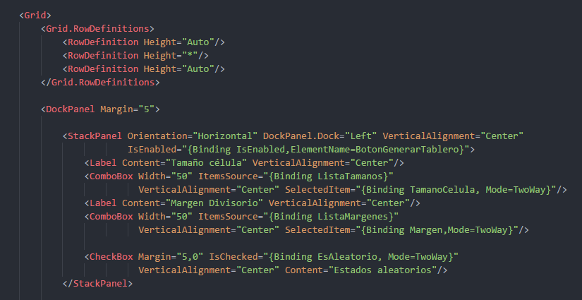
By using the Grid, StackPanel and DockPanel I have managed to create most of the UIs I’ve designed in several WPF applications with no limitations whatsoever. This does not mean that the rest of the Panels are not relevant or useful, on the contrary, they are very much so. However, it is not until one can understand and easily imagine how the user interface will look like by using those three Panels, that one can truly appreciate what the rest of them bring to the table.
Lastly, never underestimate the power of simplicity and routine. Users get accustomed to the activities they carry out on your app and, quickly enough, start predicting or assuming how UIs work. That means, among other things, most message boxes won’t be read, the OK button will be hit after having barely scanned the UI and unexpected results will be the software’s responsibility. As such, it is important to keep design practices standard throughout the app’s life. This clause translates in that most of what is presented to the user can follow my original advice: “Do most things with three Panels”.
References:
Buggy C# Code: The 10 Most Common Mistakes in C# Programming
https://www.toptal.com/c-sharp/top-10-mistakes-that-c-sharp-programmers-make